Brand extension & launch campaign
Zesty — juice but fresher
A home-pressed juice line built as an extension of the HelloFresh ecosystem rather than a standalone brand — vibrant, fluid and unmistakably fresh, from key visual down to the funnel.
- Client
- HelloFresh
- Industry
- Food & Beverage · D2C
- Type of work
- Digital design
- Year
- 2026
Brand design
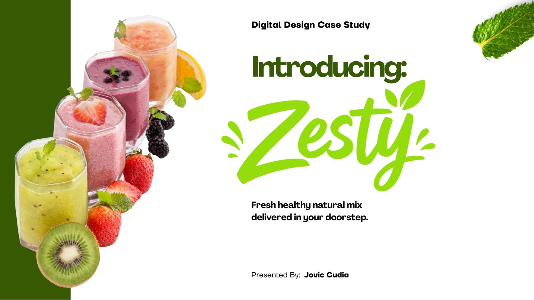
Zesty was designed as an extension of the HelloFresh ecosystem rather than a standalone juice brand. The creative direction is built around one idea — vibrant, fluid, fresh — highlighting the experience of turning real fruit and vegetables into juice at home.
Each kit ships selected ingredients and simple recipe cards, so the creative had to sell an action, not just a flavour: pressed by you.
Audience
Three demand pockets shaped the copy and the crops: fitness enthusiasts after post-workout replenishment, busy professionals who want a quick healthy choice mid-workday, and parents looking for a family drink without added sugar.
Brand derivation
The yellow-green blurb carries fruit freshness and the fluid motion of a pour. Compressed leading on the headline gives the type a pressed, crushed, mixed feeling. The plain white ground stays out of the way — mixed fruit and vegetables are already vibrant enough.
Funnel
Social layouts are staged by intent. Awareness introduces a brand-new product category with a bold visual identity. Consideration puts ingredients in motion. Intent places the finished juice inside a relatable morning ritual. A hook-focused Instagram reel opens the launch by answering a craving rather than explaining a product.